- Year
- 2025
- Context
- Institutional TVET Recruitment Poster Campaign
- Role
- Visual Designer & Campaign Layout
- Category
- Graphic Design
Project Summary
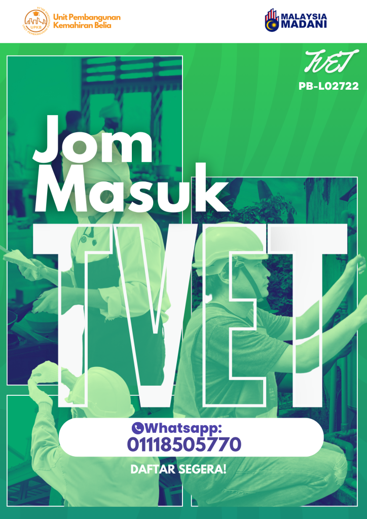
TVET Recruitment Poster Series is a three-poster campaign that I designed to encourage young people to consider Technical and Vocational Education and Training (TVET) as a practical pathway for developing skills and future career opportunities.
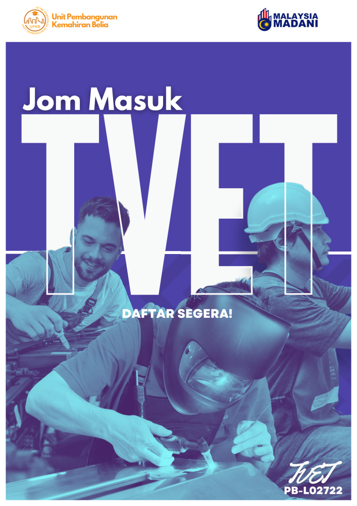
For this project, I created a consistent campaign identity using bold typography, vocational imagery and strong colour treatments. Each poster communicates slightly different information while still maintaining the same overall visual style.
Idea / Concept
My main idea was to present TVET as something active, practical and relevant to young people.
I wanted the posters to feel energetic rather than overly formal, so I used oversized typography and images showing hands-on technical and vocational activities.
The large TVET lettering became one of the main visual elements throughout the campaign, helping the message stand out immediately while also creating a recognisable identity across all three posters.
Technique / Approach
I used portrait layouts with large sans-serif typography, strong colour blocking, duotone-style photography and clearly separated information areas.
The vocational images were positioned as key visual elements to show the practical nature of TVET, while the typography was arranged to create a clear hierarchy between the campaign message, supporting information and calls to action.
Although each poster contains different information, I repeated selected typography styles, colour treatments and layout elements so that all three designs remained connected as one campaign.
Creative Process / Idea Generation
I started by identifying the main message, supporting information, logos and vocational imagery that needed to appear throughout the campaign.
From there, I developed a flexible portrait layout that could be adapted for different versions of the poster without losing the overall campaign identity.
I experimented with different image crops, colour treatments and typography sizes to find a composition that felt energetic while still keeping the information easy to understand.
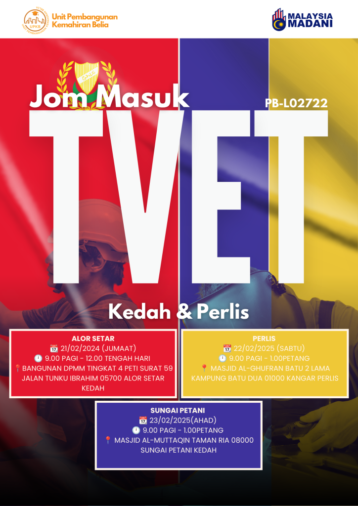
For posters containing more event details, I adjusted the layout and spacing to give the additional information enough visibility without making the design feel too crowded.
I also reviewed all three posters together to make sure the typography, colours and image treatment remained visually consistent across the series.
Tools / Software
1. Adobe Photoshop
2. Canva
Final Outcome
The final outcome is a coordinated series of three TVET recruitment posters that share one consistent campaign identity.
Each poster uses the same core visual language while adapting the layout to different communication needs, from a simple recruitment message to more detailed event information.
One of the campaign variations also presents recruitment session information, including an Alor Setar event on 21 February 2025.
The completed series demonstrates how one visual system can be adapted across several promotional materials while maintaining consistency and clear communication.
Behind the Work
One of the main challenges in this project was creating posters that felt energetic and attractive while still presenting the required information clearly.
The campaign needed to include vocational imagery, institutional logos, recruitment messages and, in some versions, more detailed event information. I had to make sure these elements worked together without making the layout feel overcrowded.
I decided to use the large TVET typography as the main visual anchor. This gave the campaign a strong identity and helped connect the three posters even when the supporting content changed.
I also used strong colour treatments and vocational photography to create a more youthful and active visual style. The images were selected and cropped to emphasise hands-on activities and reinforce the practical nature of TVET.
For the poster containing more event information, I had to pay closer attention to hierarchy and spacing. The main message still needed to attract attention first, while dates, locations and other supporting details had to remain easy to find and read.
Working on this poster series helped me understand how a campaign design needs to remain flexible. Instead of designing three completely separate posters, I learned to create one visual system that could be adapted to different content while still maintaining a consistent identity.
Gallery