- Year
- 2026
- Context
- Personal portfolio website
- Role
- Web design, content architecture and WordPress implementation
- Category
- Web Design
Project Summary
This portfolio website was created to bring together my multidisciplinary creative work in one organised digital platform. It features a cinematic homepage, a filterable project archive and individual case studies that explain the ideas, techniques and process behind each project.
I wanted the website to represent both my creative identity and the different areas of work that I have explored, including graphic design, motion graphics, video production, photography, interactive media and web design.
Idea / Concept
My main idea was to create a portfolio that feels creative and visually distinctive while still being easy to navigate.
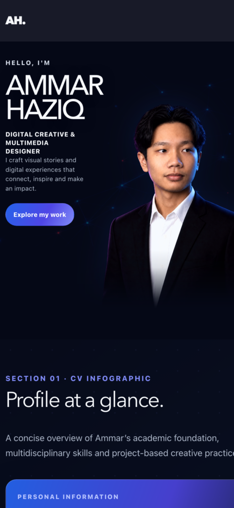
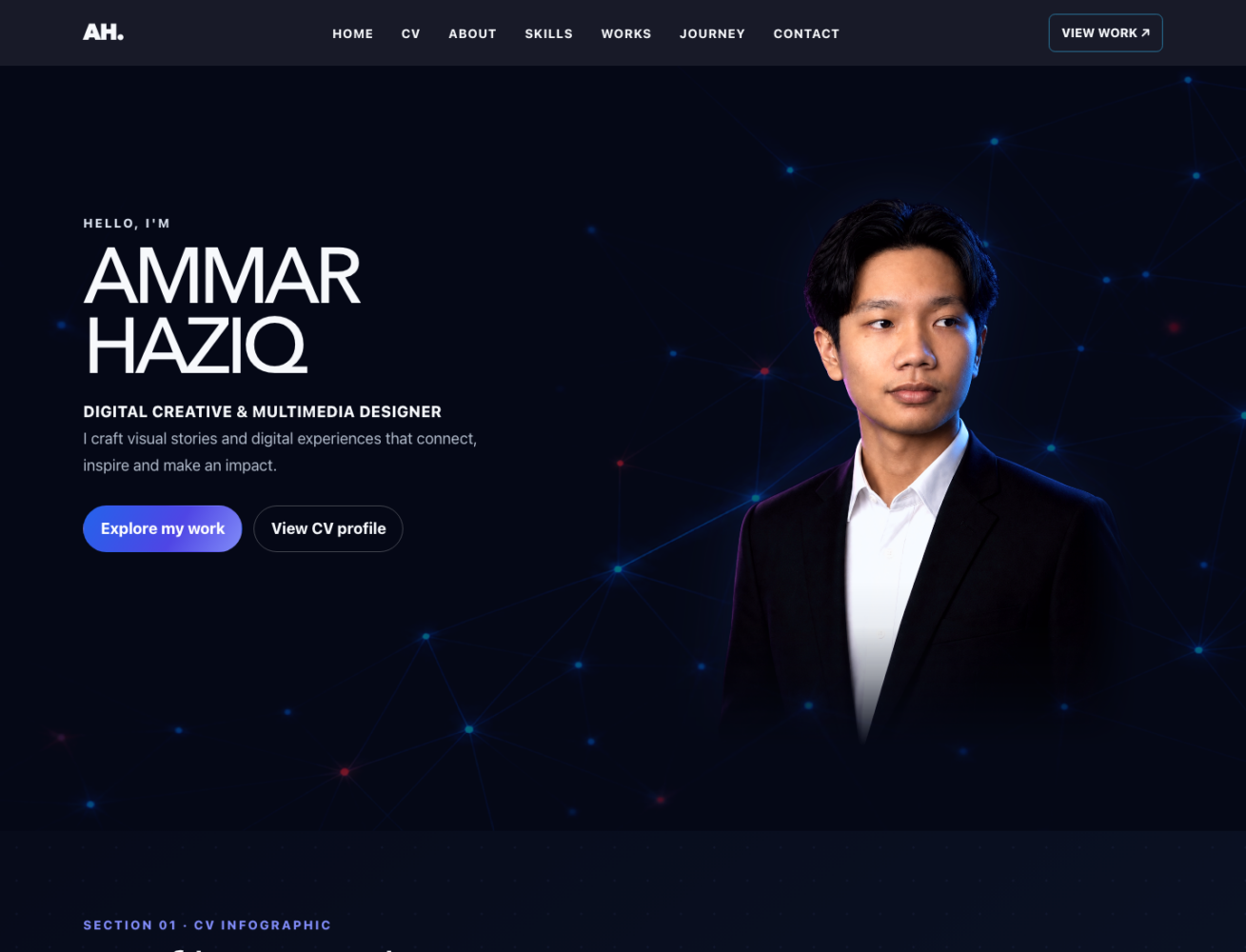
I chose a combination of dark and light sections to create contrast throughout the website. The darker cinematic sections are used to establish my identity and create a stronger first impression, while the lighter sections are mainly used to present artwork and project information more clearly.
I also wanted each project to feel connected as part of one portfolio, even though the work covers several different creative areas.
Technique / Approach
I built the portfolio using WordPress with a responsive structure that works across desktop, tablet and mobile devices.
The website uses a dedicated Projects post type and category system so that my work can be organised into different creative areas and displayed through a filterable Works archive.
I also used reusable case-study templates so that each project follows a consistent structure covering the project summary, idea, technique, creative process, tools and final outcome.
Responsive images, lazy loading, mobile navigation and layouts for different screen sizes were also included to improve performance and usability.
Creative Process / Idea Generation
I started by reviewing my existing artwork and identifying the projects that best represented the different areas of my creative work.
From there, I planned the overall structure of the website and how visitors would move between the homepage, project archive, categories and individual case studies.
Before developing the website, I explored different visual directions and created layout ideas to find a style that matched my personality and creative work. I eventually chose a combination of a dark cinematic introduction and lighter artwork-focused sections.
The website was first developed and tested using LocalWP. During the development process, I worked on the homepage, Works archive, category filters and reusable case-study layouts.
I tested the website across different screen sizes, from mobile layouts at around 360px to larger desktop screens at 1440px, and made adjustments to typography, spacing, navigation, images and content hierarchy.
After completing the development and testing process, the website was deployed to my live domain at ammarhn.com.
Tools / Software
1. WordPress 7.1
2.Hello Elementor
3. Elementor Free
4. LocalWP
5. PHP
6. HTML
7. CSS
8. JavaScript
Final Outcome
The final outcome is a fully deployed responsive portfolio website available at ammarhn.com.
The website includes a cinematic homepage, filterable Works archive, reusable project case studies, responsive mobile navigation and structured content across six creative categories.
The structure also makes it easier for me to continue adding new projects in the future without having to redesign the entire website.
More importantly, the website now provides one central platform where I can present my academic background, creative skills and portfolio work in a consistent and professional way.
Behind the Work
Creating this portfolio made me think about more than just how a website should look. I also had to consider how visitors would explore my work, how different projects should be organised and how the overall website could represent my identity as a multidisciplinary creative student.
One of the main challenges was presenting projects from several different areas without making the website feel confusing. I organised the work into six creative categories and used a consistent case-study format so that visitors can easily understand each project.
I also wanted the website to have its own visual identity without distracting attention away from the artwork. This led me to use a darker cinematic style for the introductory areas and cleaner, lighter sections for project-focused content.
Another important part of the project was responsive design. I tested the website on different screen sizes and refined the typography, spacing, navigation and image presentation so that the experience remained consistent on both desktop and mobile devices.
The website was structured so that new projects can be added using the same case-study format instead of creating a completely new layout each time. This makes the portfolio easier to maintain and allows it to continue growing as I create more work.
Working on this project helped me understand that web design is not only about visual appearance. It also involves information architecture, navigation, responsive behaviour, content organisation, performance and user experience.
The completed website now acts as a central platform for my creative work and gives me a portfolio that I can continue developing as my skills and experience grow.
Gallery