- Year
- 2024
- Context
- Product Promotion Motion Graphics
- Role
- Motion Design & Video Editing
- Category
- Motion Graphics & Animation
Project Summary
Dashing Perfume Product Promo is a 32-second motion graphics video that I created to promote three Dashing fragrance variants: Speed Surge, Cool Aqua and Style Legend.
For this project, I wanted each fragrance to have its own visual personality while still feeling connected as part of one Dashing campaign. I combined product imagery, bold typography, colour, graphic elements and motion to create a short promotional video with an energetic and modern visual style.
Idea / Concept
My main idea was to give each fragrance a different visual identity through colour.
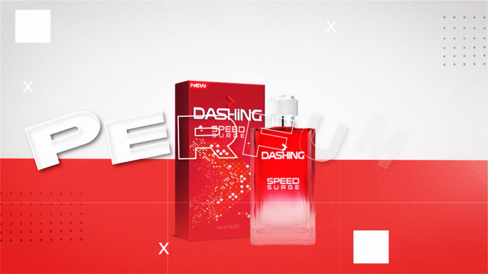
I used red for Speed Surge, blue for Cool Aqua and black for Style Legend. These colour phases help distinguish each fragrance and create clear transitions throughout the video.
Although every product has its own colour treatment, I maintained a consistent style across the compositions, typography and supporting graphic elements so that all three fragrances remain visually connected under the same campaign.
Technique / Approach
I used product cutouts, colour-blocked compositions, oversized three-dimensional typography, geometric accents and price callouts to create each promotional scene.
The product and packaging were kept as the main visual focus, while typography and supporting graphics were arranged around them to add energy and movement.
Using Adobe After Effects, I animated the visual elements and controlled the timing and transitions between each fragrance section. I also paid attention to the pacing so that every product had enough time on screen to be recognised before transitioning into the next variant.
The final video was produced in Full HD at 1920 × 1080 resolution and 30 frames per second.
Creative Process / Idea Generation
I started by selecting the three Dashing fragrance variants and deciding on a different colour direction for each product.
I prepared the product and packaging images in Adobe Photoshop before arranging them together with typography and supporting graphic elements. I experimented with different product sizes, placements and headline treatments until I found compositions that kept the fragrances as the strongest visual elements.
Once the visual direction for each fragrance was established, I brought the compositions into Adobe After Effects and worked on the motion.
I animated the graphic elements, refined the timing and experimented with transitions to connect the three product sections into one continuous promotional sequence.
Throughout the process, I reviewed the video several times to make sure the movement did not become too distracting and that viewers still had enough time to recognise the product name, packaging and promotional information.
Tools / Software
1. Adobe Photoshop
2. Adobe After Effect
Final Outcome
The final outcome is a 32-second Full HD motion graphics advertisement featuring three Dashing fragrance variants: Speed Surge, Cool Aqua and Style Legend.
Each fragrance has its own visual identity through the use of red, blue and black colour phases, while the repeated composition style, typography and motion language connect all three products as part of one campaign.
The completed video can be viewed directly on this portfolio page.
Behind the Work
One of the main challenges in this project was finding a way to make three different products feel unique while still maintaining one consistent campaign identity.
I decided to use colour as the main element that separates each fragrance. Speed Surge uses a strong red visual direction, Cool Aqua moves into blue, while Style Legend uses a darker black treatment. This gave every product its own character without requiring a completely different design style for each section.
I also had to think differently compared with designing a static poster. In motion graphics, a composition does not only need to look good on one frame. I also had to consider how the elements enter the screen, how long they remain visible and how they transition into the next scene.
I experimented with the timing of the product images, typography and graphic elements in Adobe After Effects until the movement felt energetic without becoming too fast or distracting.
Another important consideration was maintaining the product as the main focus. Even though I used large typography, geometric elements and motion effects, I tried to make sure these elements supported the fragrance rather than competing with it.
This project helped me understand how graphic design principles such as composition, colour, typography and hierarchy can be extended into motion. It also gave me more experience in using timing, transitions and animation to create a complete promotional video rather than a series of static visuals.