- Context
- Editorial E-Magazine Design
- Role
- Editorial Layout & Visual Presentation
- Category
- Graphic Design
Project Summary
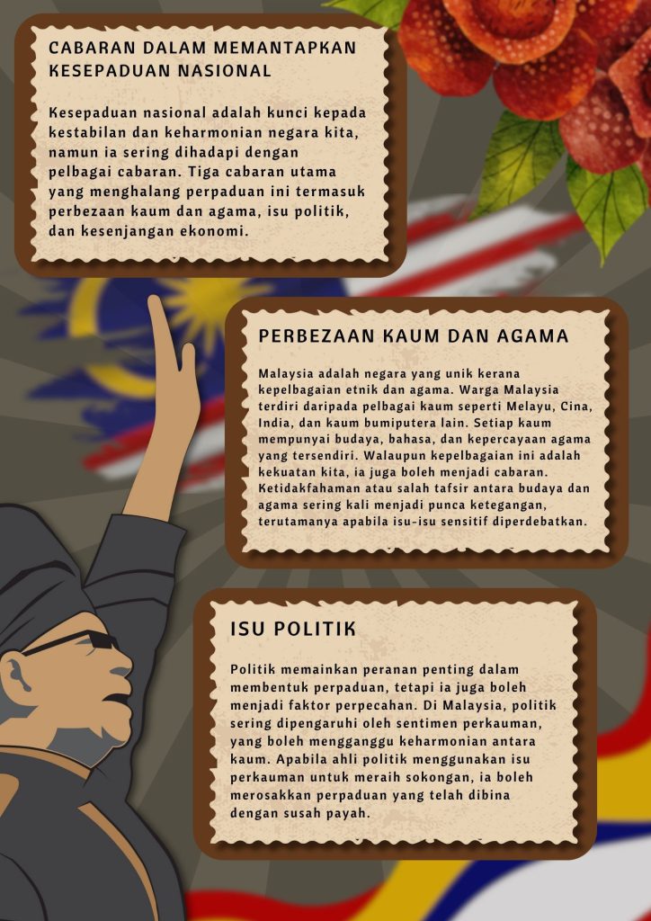
National Unity E-Magazine is a four-page digital publication that I designed to present information about national unity through a structured and visually engaging editorial format.
The project combines Malay-language content, historical imagery, typography and colour to create a publication that feels informative while still being easy to read.
My main focus was to organise a large amount of information into a clear page-by-page structure while maintaining a consistent visual identity throughout the magazine.
Idea / Concept
My main idea was to present the topic of national unity in a way that feels educational but not overly formal.
I wanted the magazine to communicate themes of identity, history and shared social values while keeping the content visually approachable.
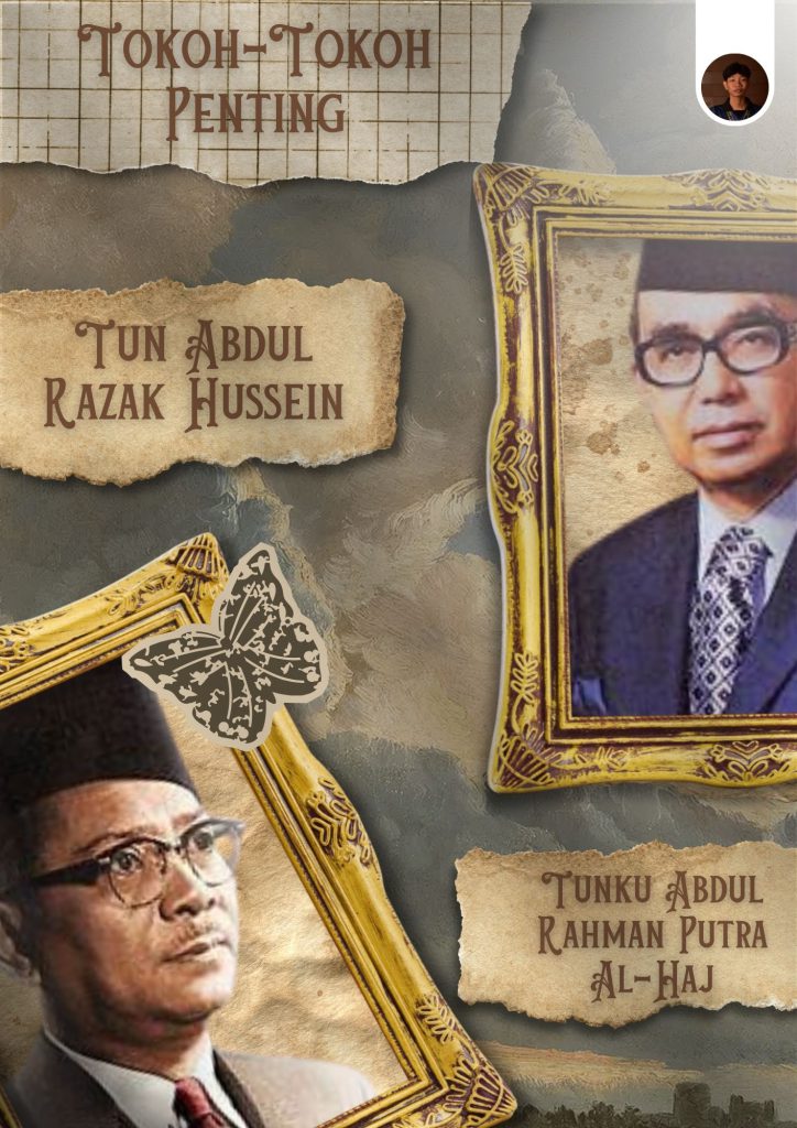
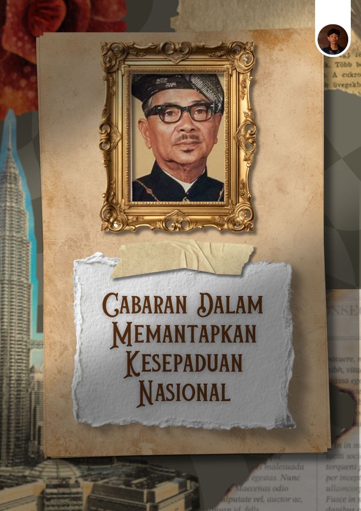
To achieve this, I combined strong headings, supporting images, colour panels and structured text areas so that readers could move through the information in a clear sequence.
Technique / Approach
I used a portrait editorial layout with headline hierarchy, text columns, image placement and colour panels to organise the content.
A consistent typography style and spacing system were maintained across all four pages so that the publication felt connected from beginning to end.
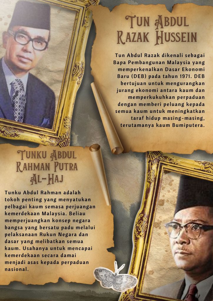
At the same time, I adjusted each page depending on the amount of text and imagery available. Some pages required more space for written information, while others relied more heavily on historical images and supporting visual elements.
This allowed the layouts to remain flexible without losing the overall editorial identity.
Creative Process / Idea Generation
I started by reviewing the available content and grouping the information into separate page themes.
From there, I planned the reading sequence and decided how the information should be distributed across the four pages. I then established the basic margins, typography hierarchy and content areas that would form the visual structure of the publication.
After the main structure was created, I placed the written content and supporting imagery into each page and adjusted the layout depending on the amount of information being presented.
I experimented with different image sizes, text columns, heading positions and colour panels to make the pages easier to read while maintaining visual variety.
Throughout the process, I reviewed the four pages together to make sure the publication remained consistent and that the visual rhythm flowed naturally from one page to the next.
Tools / Software
1. Adobe Photoshop
2. Adobe Illustrator
3. Canva
Final Outcome
The final outcome is a four-page digital e-magazine that presents national unity content through a consistent editorial system.
Each page uses a combination of typography, imagery, colour and structured information while adapting to different amounts of content.
The completed publication demonstrates my ability to organise information across multiple pages while maintaining visual hierarchy, readability and consistency.
Behind the Work
One of the main challenges in this project was organising a large amount of Malay-language information without making the pages feel too dense.
Because the project involved several pages, I had to think beyond individual layouts and consider how the publication would work as a complete sequence.
I used repeated typography styles, margins, colour treatments and content structures to create consistency across the magazine. At the same time, I allowed each page to have a slightly different arrangement depending on the type and amount of information being presented.
Historical images were used to support the written content and break up longer sections of text. I also paid attention to where the images were placed so that they helped guide the reader through the page rather than becoming decorative elements only.
Another important part of the project was information hierarchy. I had to decide which headings, images and sections should attract attention first and how supporting information should be arranged around them.
Working on this e-magazine helped me understand how editorial design is different from designing a single poster. A multi-page publication needs consistency, pacing and a clear reading sequence across several layouts.
It also gave me more experience in balancing typography, imagery and information so that a publication can remain visually interesting while still communicating its content clearly.
Gallery