- Context
- Product Advertising Concept / Portfolio Project
- Role
- Graphic Designer, Product Compositing & Poster Layout
- Category
- Graphic Design
Project Summary
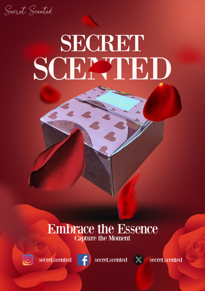
Secret Scented is a product advertising concept that I created to explore how visual composition, colour and typography can be used to present a product in a more refined and attractive way. My main focus was to make the product the centre of attention while creating an overall visual that feels suitable for a modern fragrance advertisement.
Idea / Concept
My idea was to create a clean and elegant promotional visual that gives the product a premium and desirable appearance. I wanted the design to feel atmospheric without becoming too busy, so I kept the composition focused on the product and used the surrounding elements mainly to support its mood and character.
Technique / Approach
I used product compositing, colour grading, soft lighting effects and layered typography to build the final composition. I also worked with contrast and negative space to create a clear visual hierarchy, making sure the viewer notices the product first before moving on to the headline and supporting information.
Creative Process / Idea Generation
I started by deciding on the overall mood and colour direction that would best complement the product. After preparing the product image, I experimented with different placements, background treatments and headline positions.
I then adjusted the lighting, shadows and colour tones so that the product blended naturally into the composition instead of looking like a separate image placed on top of the background. I also refined the typography and spacing several times to keep the layout balanced and make the promotional message easy to read.
Tools / Software
1. Adobe Illustrator
2. Adobe Photoshop
Final Outcome
The final result is a product advertisement that combines product presentation, visual atmosphere and promotional typography in a single composition. Through this project, I was able to practise creating a stronger visual hierarchy and explore how lighting, colour and layout can influence the way a product is presented to an audience.
Behind the Work
For this project, I wanted to challenge myself to create more than just a simple product poster. I wanted the advertisement to communicate a certain mood while still keeping the product as the strongest visual element.
One of the main challenges was finding the right balance between the background effects, typography and product image. Adding too many elements made the composition feel crowded, while keeping it too simple reduced the advertising impact. I experimented with different layouts, colour treatments and lighting until the overall composition felt more balanced.
I paid particular attention to how the product interacted with the background by refining its lighting and shadow so that it felt naturally integrated into the scene. I also adjusted the size and placement of the headline and supporting information to create a clearer reading order.
This project helped me understand how composition, colour, typography and visual hierarchy work together in product advertising, and how small design adjustments can make the final presentation feel more polished and convincing.