- Context
- Website Content Graphic Series
- Role
- Information Design & Visual Content Production
- Category
- Graphic Design
Project Summary
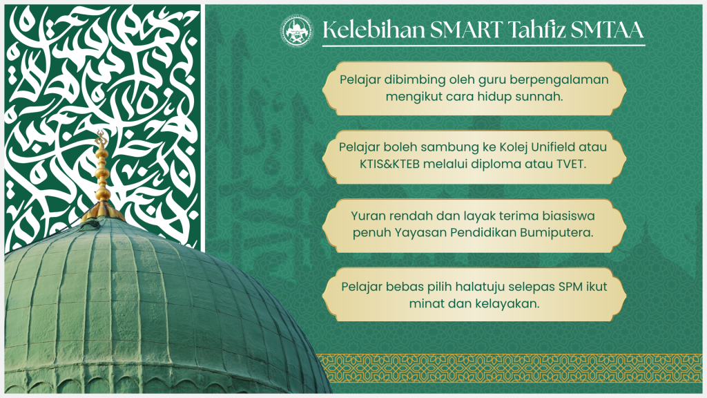
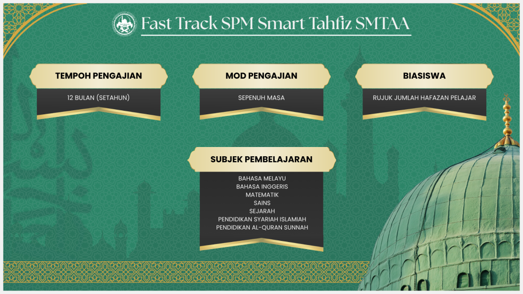
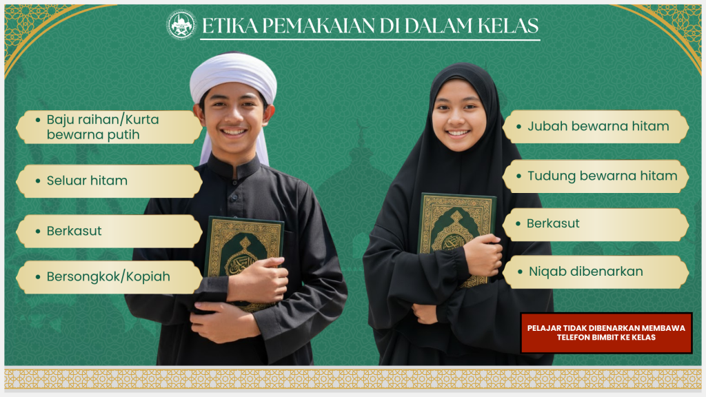
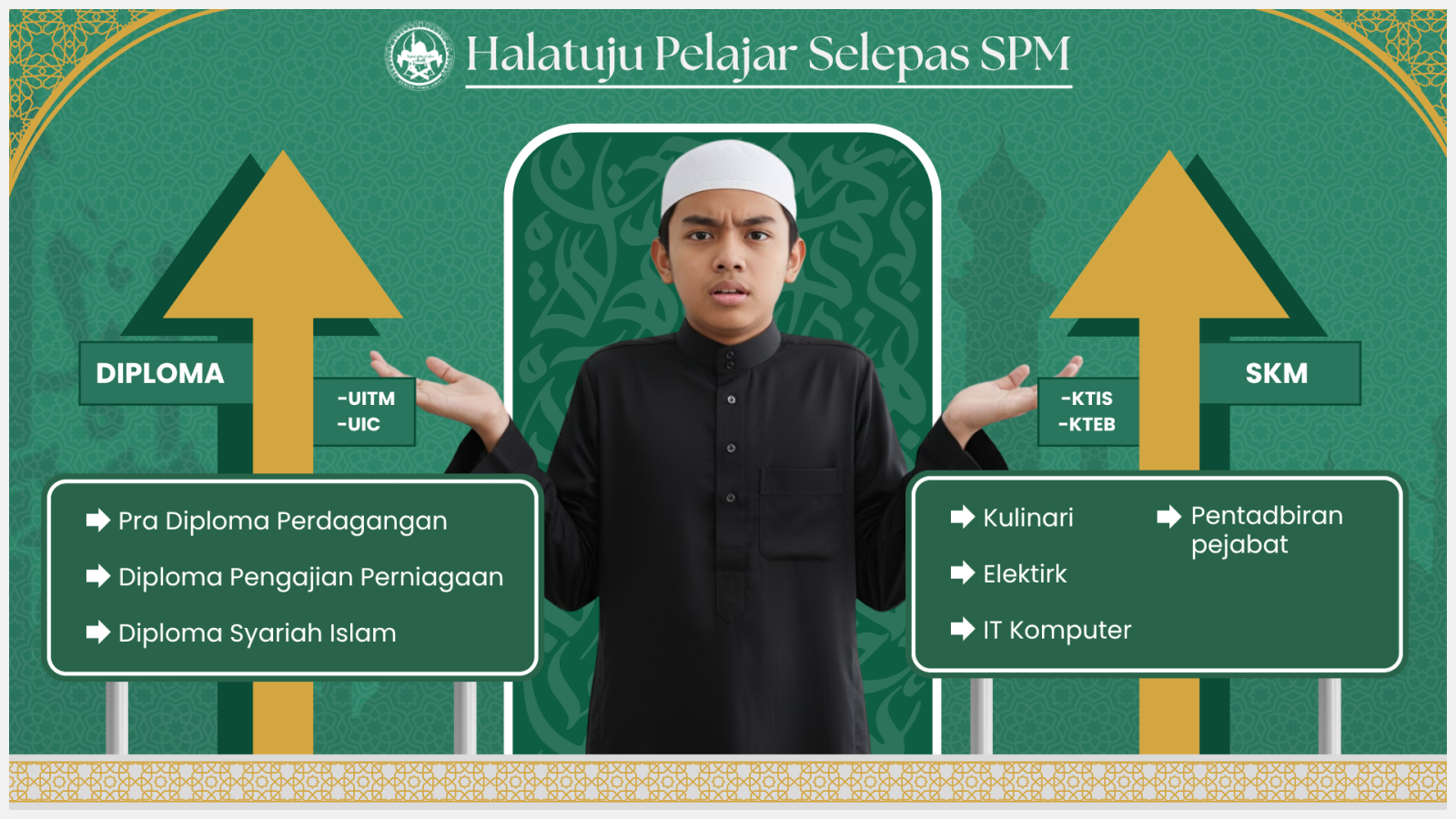
Smart Tahfiz Website Content Series is a set of four information graphics that I created to present different types of school and programme information in a clear and visually consistent format.
The series covers several topics, including programme benefits, student pathways, programme information and dress guidance.
My aim was to make each topic easy to understand while maintaining a consistent visual identity across the entire series.
Idea / Concept
My main idea was to turn information that could normally feel text-heavy into visual content that is easier and more welcoming to read.
Each graphic focuses on one main topic, but I wanted all four designs to feel connected as part of the same Smart Tahfiz communication series.
To achieve this, I used a consistent landscape format, repeated brand colours, similar typography and structured content areas while adapting the layout depending on the amount and type of information presented.
Technique / Approach
I used a combination of headings, illustrations or photography, colour blocks and grouped information to create a clear visual hierarchy.
The main heading acts as the first point of attention, followed by supporting information that is divided into smaller sections to make the content easier to scan.
I maintained consistent spacing, colour treatments and layout elements across the four designs so that even though each screen contains different information, they still feel like part of one visual system.
Creative Process / Idea Generation
I started by reviewing the available information and dividing it into four main themes.
For each theme, I identified the most important message first and then organised the supporting information around it. This helped me decide which content needed stronger visual emphasis and which information could be presented in smaller supporting sections.
I then developed a reusable layout structure that could be adapted to each topic.
Because the amount of content was different from one screen to another, I adjusted the size and positioning of headings, imagery and information blocks while keeping the overall spacing, colours and visual identity consistent.
Throughout the process, I reviewed all four graphics together to make sure they looked like one complete series rather than separate individual designs.
Tools / Software
1. Adobe Photoshop
2. Adobe Illustrator
3. Canva
Final Outcome
The final outcome is a coordinated series of four information graphics covering programme benefits, student pathways, programme information and dress guidance.
Each design communicates a different type of information while sharing the same overall visual identity.
The completed series demonstrates how one graphic system can be adapted to different content requirements while maintaining clear information hierarchy and visual consistency.
Behind the Work
One of the main challenges in this project was presenting several different types of information while making all four designs feel connected.
Some screens contained more text and detailed programme information, while others relied more heavily on imagery and shorter messages. Because of this, I could not use exactly the same arrangement for every screen.
Instead, I created a flexible visual structure that allowed the layout to change depending on the content while keeping selected elements consistent, such as the colours, typography, spacing and overall landscape format.
I also had to think carefully about information hierarchy. I wanted viewers to understand the main topic immediately before moving into the supporting details, so I used larger headings and grouped related information together instead of presenting everything with the same visual importance.
Working on this project helped me understand how graphic design can make information easier to communicate. It also taught me that consistency does not mean every design has to look exactly the same. A visual system can remain recognisable while still adapting to different types and amounts of content.
This project gave me more experience in information design, content organisation and creating a small visual series that works together as one complete communication system.
Gallery